Hockey Data Visualization

Why first round draft picks are superior beings
Assignment
DataViz
Tables
Scatterplot
Barplot
Piechart
Author

Cody Appa

Published

July 7, 2023

OVERVIEW

In this assignment, we are going to practice creating visualizations for tabular data. Unlike previous assignments, however, this time we will all be using the same data sets. I’m doing this because I want everyone to engage in the same logic process and have the same design objectives in mind.

Vancouver receives: The 7th pick in the second round (39th overall), the 10th pick in the second round (42nd overall), and the 10th pick in the third round (74th overall).

Detroit receives: The 1st pick in the first round (1st overall).

Doofenschmirtz reasons that more draft picks are better, and is inclined to make the trade. Cassandra isn’t so sure…

She asks you to create some data visualizations she can show to her boss that might help him make the best decision.

Code
library(tidyverse)
── Attaching packages ─────────────────────────────────────── tidyverse 1.3.2 ──
✔ ggplot2 3.4.0      ✔ purrr   1.0.1 
✔ tibble  3.1.8      ✔ dplyr   1.0.10
✔ tidyr   1.2.1      ✔ stringr 1.5.0 
✔ readr   2.1.3      ✔ forcats 0.5.2 
── Conflicts ────────────────────────────────────────── tidyverse_conflicts() ──
✖ dplyr::filter() masks stats::filter()
✖ dplyr::lag()    masks stats::lag()
Code
library(dplyr)
library(ggplot2)
library(readxl)

NHLDraft<-read.csv("NHLDraft.csv")
NHLDictionary<-read_excel("NHLDictionary.xlsx")
glimpse(NHLDraft)
Rows: 105,936
Columns: 12
$ X           <int> 1, 2, 3, 4, 5, 6, 7, 8, 9, 10, 11, 12, 13, 14, 15, 16, 17,…
$ draftyear   <int> 2001, 2001, 2001, 2001, 2001, 2001, 2001, 2001, 2001, 2001…
$ name        <chr> "Drew Fata", "Drew Fata", "Drew Fata", "Drew Fata", "Drew …
$ round       <int> 3, 3, 3, 3, 3, 3, 3, 3, 3, 3, 3, 3, 3, 3, 3, 3, 3, 3, 3, 3…
$ overall     <int> 86, 86, 86, 86, 86, 86, 86, 86, 86, 86, 86, 86, 86, 86, 86…
$ pickinRound <int> 23, 23, 23, 23, 23, 23, 23, 23, 23, 23, 23, 23, 23, 23, 23…
$ height      <int> 73, 73, 73, 73, 73, 73, 73, 73, 73, 73, 73, 73, 73, 73, 73…
$ weight      <int> 209, 209, 209, 209, 209, 209, 209, 209, 209, 209, 209, 209…
$ position    <chr> "Defense", "Defense", "Defense", "Defense", "Defense", "De…
$ playerId    <int> 8469535, 8469535, 8469535, 8469535, 8469535, 8469535, 8469…
$ postdraft   <int> 0, 1, 2, 4, 5, 10, 11, 12, 13, 3, 6, 7, 8, 9, 14, 15, 16, …
$ NHLgames    <int> 0, 0, 0, 0, 3, 0, 0, 0, 0, 0, 5, 0, 0, 0, 0, 0, 0, 0, 0, 0…
Code
knitr::kable(NHLDictionary)
Attribute Type Description
draftyear Ordinal Calendar year in which the player was drafted into the NHL.
name Item Full name of the player.
round Ordinal Round in which the player was drafted (1 to 7).
overall Ordinal Overall draft position of the player (1 to 224)
pickinRound Ordinal Position in which the player was drafted in their round (1 to 32).
height Quantitative Player height in inches.
weight Quantitative Player weight in pounds.
position Categorical Player position (Forward, Defense, Goaltender)
playerId Item Unique ID (key) assigned to each player.
postdraft Ordinal Number of seasons since being drafted (0 to 20).
NHLgames Quantitative Number of games played in the NHL in that particular season (regular season is 82 games, playoffs are up to 28 more).

In this case, we have a dataframe with all the drafted players since 2000, their position, their draft year and position, and then rows for each season since being drafted (postdraft). The key variable here is NHLgames, which tells us how many games they played in the NHL each season since being drafted.

SIMPLE SCATTERPLOT

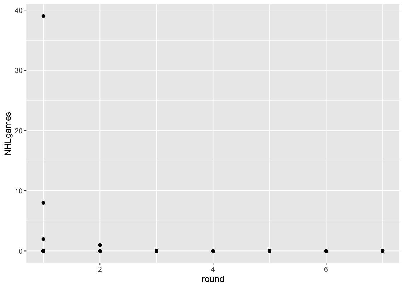
One thing to realize about professional hockey is that it is pretty rare for a player to play in the NHL right after being drafted. Players get drafted when they are 18 years old, and they usually play in the juniors, minor leagues, or the NCAA for a bit to further develop. Let’s use a scatterplot to visualize this phenomenon with the most recent draft classes.

Code
draft2022<-NHLDraft%>%
  filter(draftyear==2022 & postdraft==0)

ggplot(draft2022, aes(x=round, y=NHLgames))+
  geom_point()

Code
draft2022<-NHLDraft%>%
  filter(draftyear==2022 & postdraft==0)

ggplot(draft2022, aes(x=round, y=NHLgames,))+
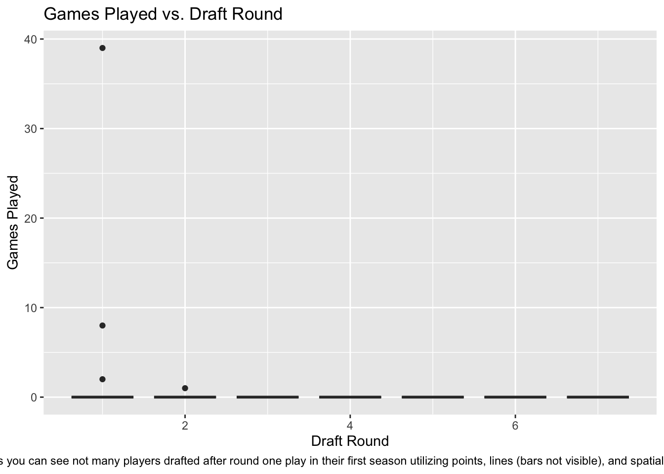
  geom_boxplot(aes(group = round))+
  labs(title="Games Played vs. Draft Round",x="Draft Round", y = "Games Played")+
  labs(caption = "As you can see not many players drafted after round one play in their first season utilizing points, lines (bars not visible), and spatial position.")+
  theme(plot.caption = element_text(hjust=.5))

Changed Visualization

I decided a boxplot graphic might better help to visualize the trend of flatlining after draft round 1. While I do think it does this, it also doesn’t fix the overplotting problem very well in this visualization. Axis labels, title, and caption were added to assist the coach in understanding the chart.

EXPANDED SCATTERPLOT

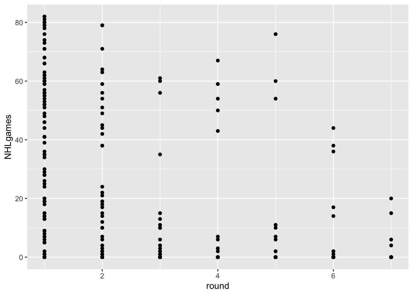
The data from the most recent draft isn’t really helpful for our question. Let’s go back in time and use a draft year that has had some time to develop and reach their potential. How about 2018?

Code
draft2018<-NHLDraft%>%
  filter(draftyear==2018 & postdraft<6)

ggplot(draft2018, aes(x=round, y=NHLgames))+
  geom_point()

Hmmm… in addition to the problem of overplotting, we’ve got an additional issue here. We actually have two keys and one attribute. The attribute is NHLgames, and the keys are round and postdraft, but we are only using round.

Postdraft indicates the number of seasons after being drafted. We have several choices here. We can make a visualization that uses both keys, or we can somehow summarize the data for one of the keys.

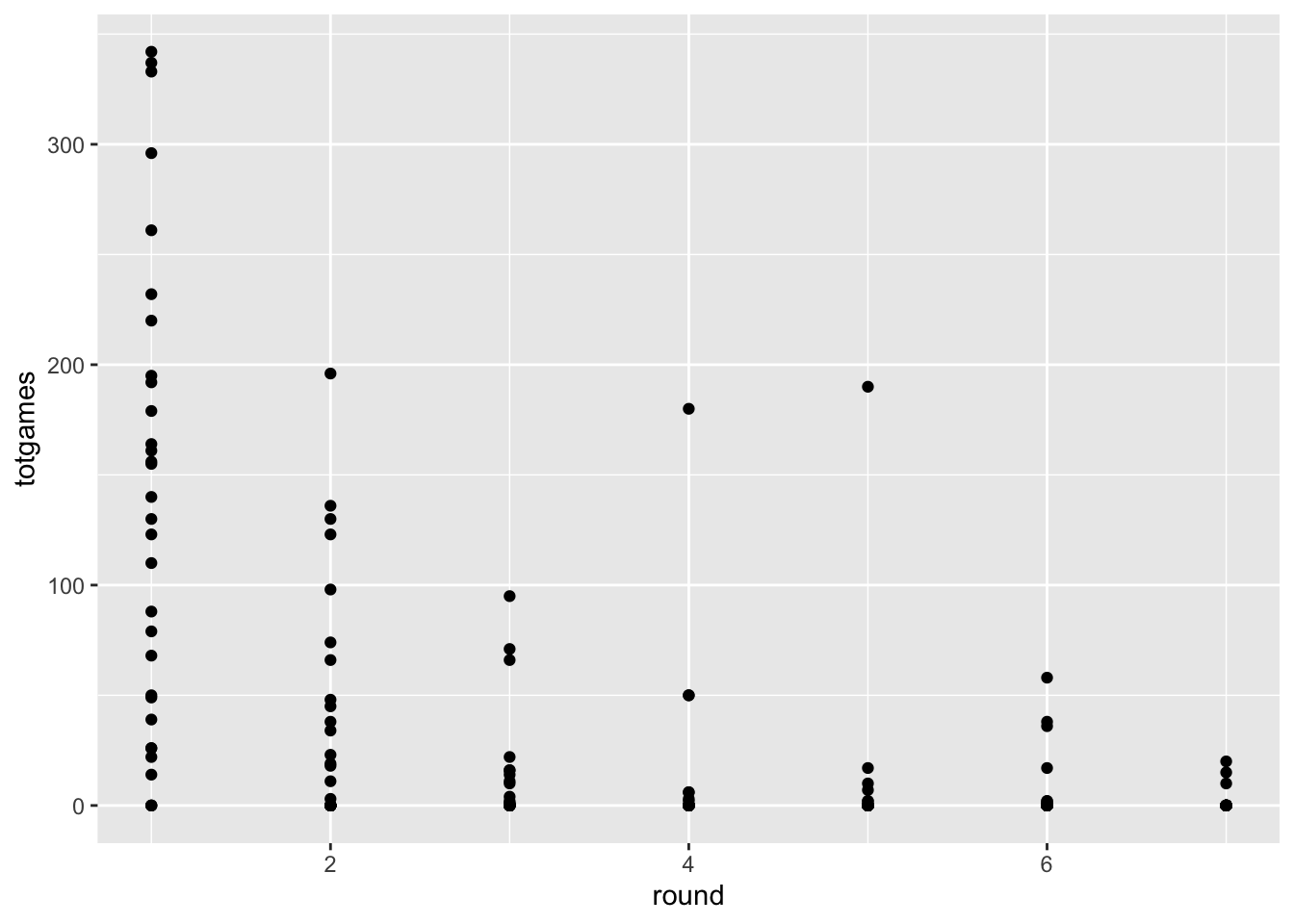
For example, let’s say we just wanted to know the TOTAL number of NHL games played since being drafted.

Code
drafttot2018<- draft2018%>%
  group_by(playerId, round, overall, position, name)%>%
  summarise(totgames=sum(NHLgames))
`summarise()` has grouped output by 'playerId', 'round', 'overall', 'position'.
You can override using the `.groups` argument.
Code
ggplot(drafttot2018, aes(x=round, y=totgames))+
  geom_point()

Code
drafttot2018<- draft2018%>%
  group_by(playerId, round, overall, position, name)%>%
  summarise(totgames=sum(NHLgames))
`summarise()` has grouped output by 'playerId', 'round', 'overall', 'position'.
You can override using the `.groups` argument.
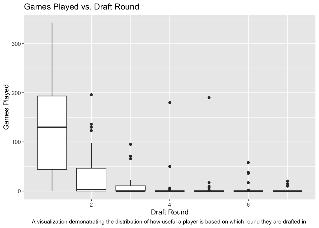
Code
ggplot(drafttot2018, aes(x=round, y=totgames,))+
  geom_boxplot(aes(group = round))+
  labs(title="Games Played vs. Draft Round",x="Draft Round", y = "Games Played")+
  labs(caption = "A visualization demonatrating the distribution of how useful a player is based on which round they are drafted in.")+
  theme(plot.caption = element_text(hjust=.5))

Plot Fix

For the expanded scatterplot a boxplot seems to work better. It adds the addition of line length as a channel which (in my opinion), assists in visualizing what is going on with the overplotting. As well as that I think the large box in round one shrinking quickly by round 3 is a heavy indicator that round 1 is the most important by far. Axis labels, title, and caption added to assist.

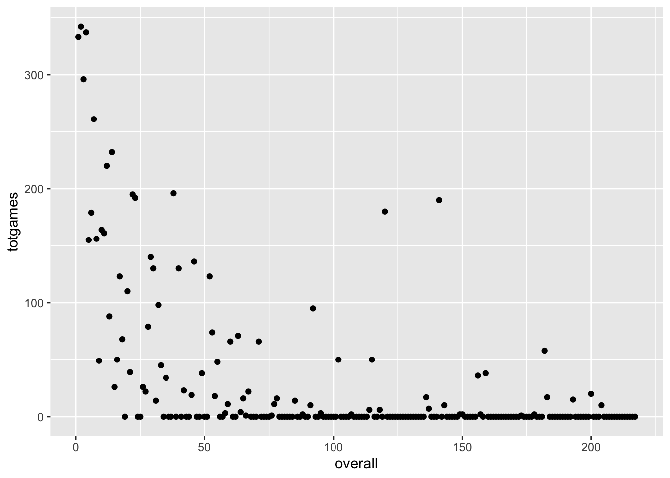
SCATTERPLOT WITH OVERALL DRAFT POSITION

This approach might yield a better match with the scatterplot idiom. What if we ignore draft round, and use the player’s overall draft position instead?

Code
ggplot(drafttot2018, aes(x=overall, y=totgames))+
  geom_point()

Code
ggplot(drafttot2018, aes(x=overall, y=totgames))+
  geom_line(color= "red")+
  geom_point()+
  labs(title="Games Played vs. Draft Round",x="Overall Pick", y = "Games Played")+
  labs(caption = "The trend of overall NHL draft picks plotted against how many games they played, the lineplot supposedly helps show a downward trend from top draft picks to middle draft picks.")+
  theme(plot.caption = element_text(hjust=.5))

Attempted Fix

As the title says it was an attempt, I honestly don’t know if it makes the visualization better but I changed the scatterplot to a line plot in order to connect the dots on all of those and show the general trend downwards with a scary red line. However, those outliers seem to make it look less scary than i intended and I couldn’t get a standard deviation cloud around the line to work or anything due to not really knowing ggplot.

SCATTERPLOT SUMMARY

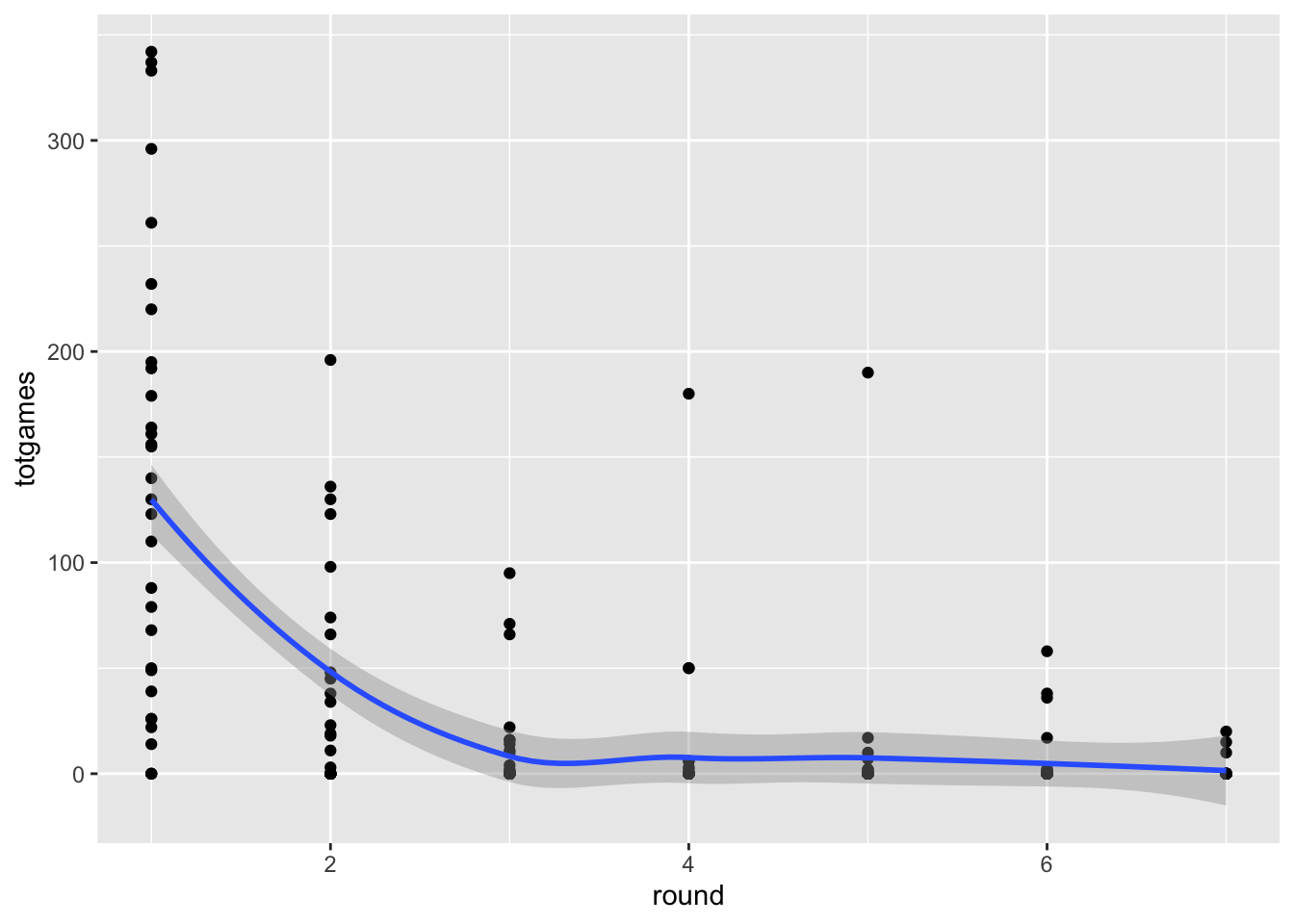
We seem to be running into an issue in terms of overplotting. Scatterplots are great, but they work best for two quantitative attributes, and we have a situation with one or two keys and one quantitative attribute. The thing is, scatterplots can be very useful when part of our workflow involves modeling the data in some way. We’ll cover this kind of thing in future assignments, but just a bit of foreshadowing here:

Code
ggplot(drafttot2018, aes(x=round, y=totgames))+
  geom_point()+
  geom_smooth()
`geom_smooth()` using method = 'loess' and formula = 'y ~ x'

Adding the smoothed line doesn’t eliminate the overplotting problem, but it does indicate that it exists. We’ll cover other potential solutions (including Cody’s violin plots!) to this issue later in the course, when we get to the notions of faceting and data reduction.

SIMPLE BAR CHART

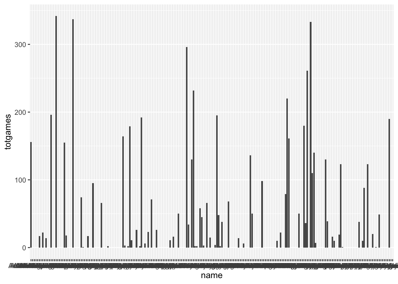
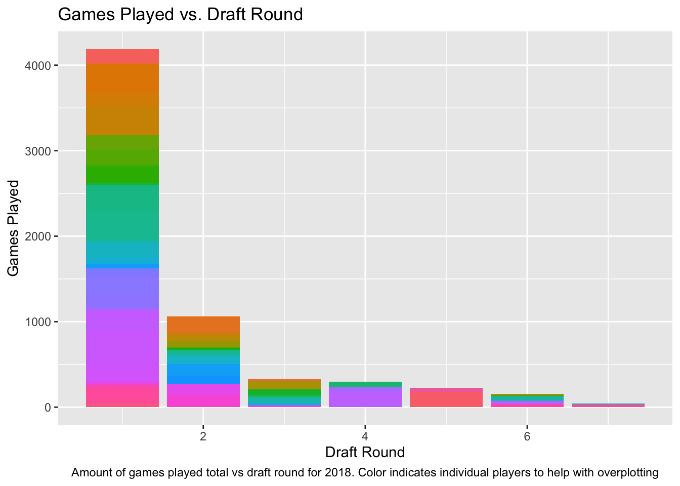
One of the best ways to deal with overplotting is to use our keys to SEPARATE and ORDER our data. Let’s do that now. I’ll stick with the summarized data for the 2018 draft year for now.

Code
ggplot(drafttot2018, aes(x = name, y=totgames))+
  geom_col()

Code
ggplot(drafttot2018, aes(x = round, y=totgames, fill = name))+
  geom_col()+
  theme(legend.position = "none")+
  labs(title="Games Played vs. Draft Round",x="Draft Round", y = "Games Played")+
  labs(caption = "Amount of games played total vs draft round for 2018. Color indicates individual players to help with overplotting")+
  theme(plot.caption = element_text(hjust=.5))

Pseudo Stacked Bar?

I basically just changed the bar graph x axis to draft round and then made the player name a channel in the bar graph to show individuals better and assist with overplotting. It’s kinda similar to the stacked bar you did but with different channels representing different things. I also got rid of the legend because it made it unreadable with color indicating player name the legend was larger than the graph.

Code
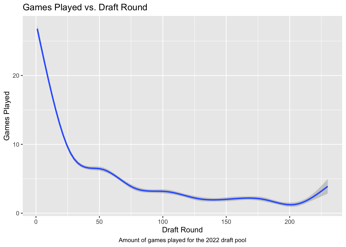
ggplot(NHLDraft, aes(x = overall, y=NHLgames))+
  geom_smooth()+
  theme(legend.position = "none")+
  labs(title="Games Played vs. Draft Round",x="Draft Round", y = "Games Played")+
  labs(caption = "Amount of games played for the 2022 draft pool")+
  theme(plot.caption = element_text(hjust=.5))
`geom_smooth()` using method = 'gam' and formula = 'y ~ s(x, bs = "cs")'

Line graph

I Think a smooth line graph with error cloud shows at a different angle what I’m trying to explain but still doesn’t really get the full picture across at total games for all the players.

Code
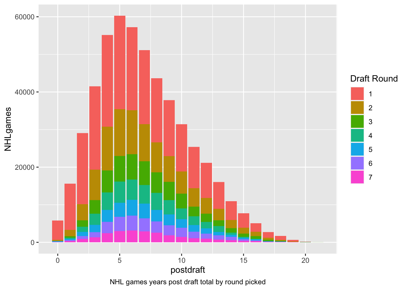
ggplot(NHLDraft, aes(x = postdraft, y=NHLgames, fill=(as.factor(round))))+
  geom_col(position = "stack")+
  labs(color = "Legend")+
  labs(fill = "Draft Round")+
  labs(caption = "NHL games years post draft total by round picked")+
  theme(plot.caption = element_text(hjust=.5))

Overlapping Bar

I think this graph lays it out in a visually pleasing way as well as getting the message across. There are issues like the round one being in the back when you want the most important to the front. But I do think to a non data scientist seeing this they could pretty easily see that round 1 players are superior to all the other draft picks combined for each year which is valuable.

PIE CHARTS / NORMALIZED BAR CHARTS

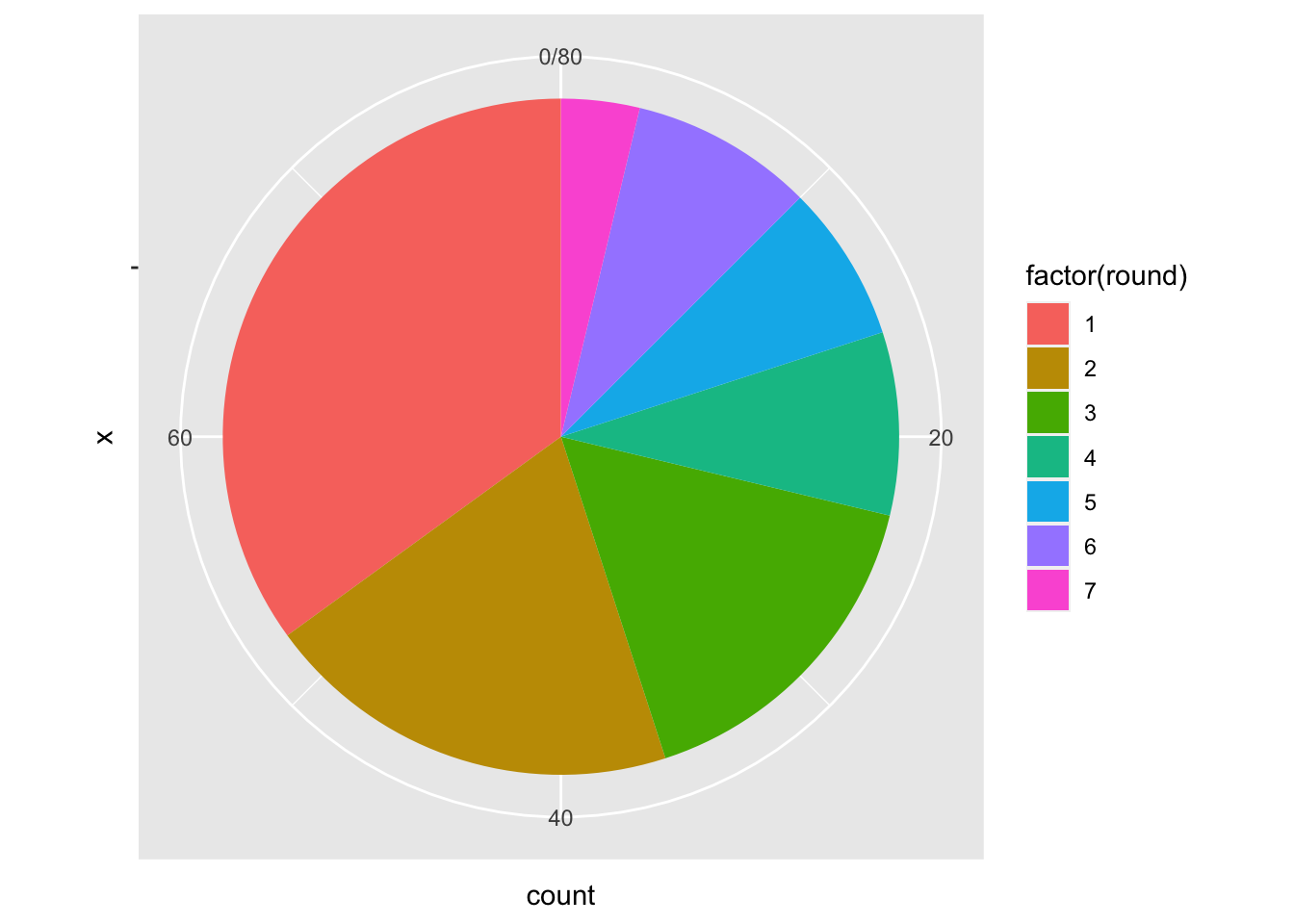
We all know that Pie Charts are rarely a good choice, but let’s look at how to make one here. I’ll eliminate all the players drafted in 2018 who never played an NHL game, leaving us 80 players drafted in that year who made “THE SHOW”. Let’s look at how those 80 players were drafted:

Code
playedNHL2018 <- drafttot2018%>%
  filter(totgames>0)

ggplot(playedNHL2018, aes(x = "", fill = factor(round))) +
  geom_bar(width = 1) +
  coord_polar(theta = "y")

Obviously this isn’t great, but can you state why? Write a little critique of this visualizaiton that:

  1. Considers a player who played hundreds of games over their first five years vs a player who played one game in five years.
  2. Evaluates the relative value of a second round pick and a third round pick.

Critique:

The Pie chart is basically just losing information, in regards to the first question it is basically just showing the relative proportion of players that just played a game. It doesn’t take into account first round picks that played hundreds vs a third round pick who played 1 game, or even a first round pick who played one game then hurt themselves. It could be a better figure if instead of counting the 80 players who played a game, it was counting the amount of games played by each round picks. This graph skews it to make it seem like if you took a second and a third round pick it would equal a first round pick. Which isn’t the case on other figures.

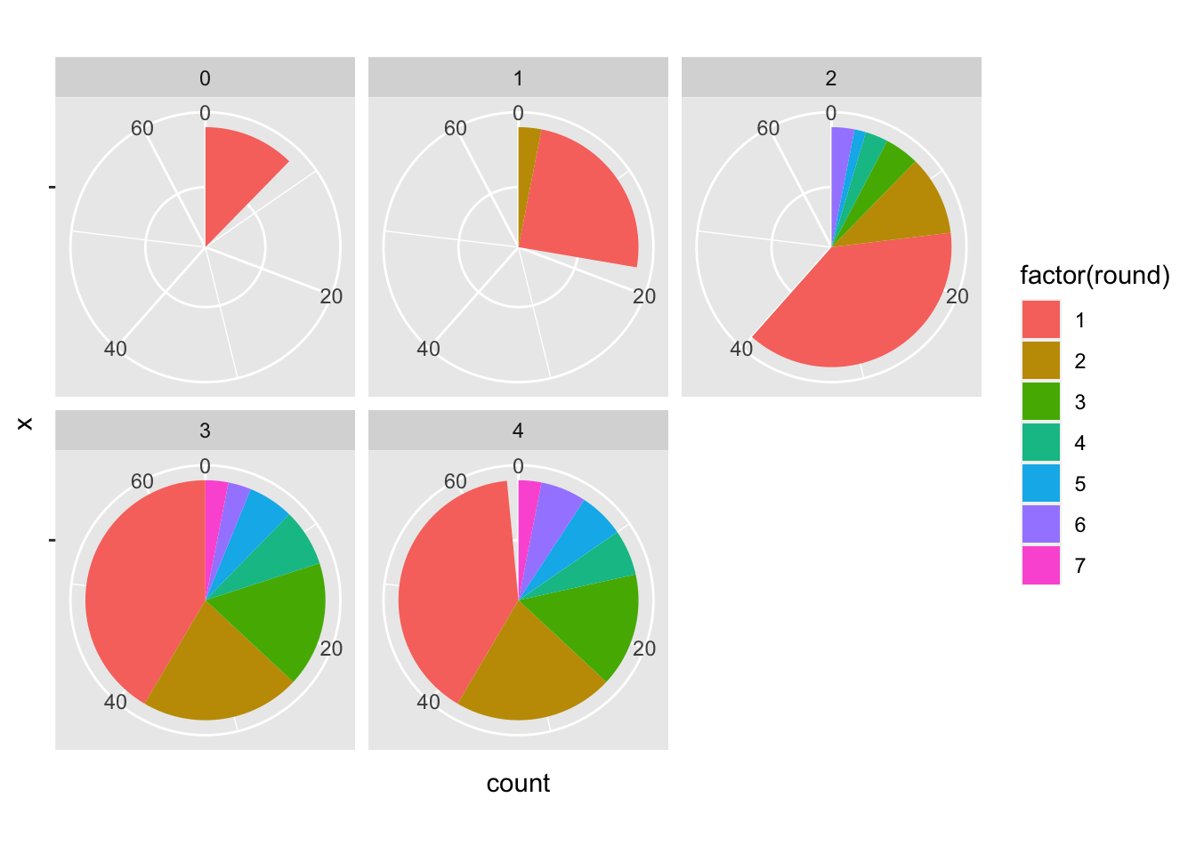
Now let’s change this to account for the various years post draft:

Code
seasonplayedNHL2018 <- draft2018%>%
  filter(NHLgames>0)


ggplot(seasonplayedNHL2018, aes(x = "", fill = factor(round))) +
  geom_bar(width = 1) +
  coord_polar(theta = "y")+
  facet_wrap(~postdraft)

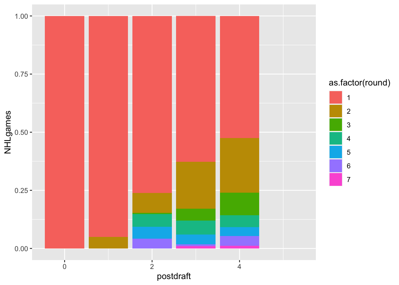
Seems like there is something to work with here, but let’s compare this to a normalized bar chart:

Code
ggplot(draft2018, aes(x = postdraft, y=NHLgames, fill=as.factor(round)))+
  geom_col(position = "fill")
Warning: Removed 218 rows containing missing values (`geom_col()`).

Can you work with this to make it a useful visualization for your friend, Cassandra Canuck?

HEATMAP?

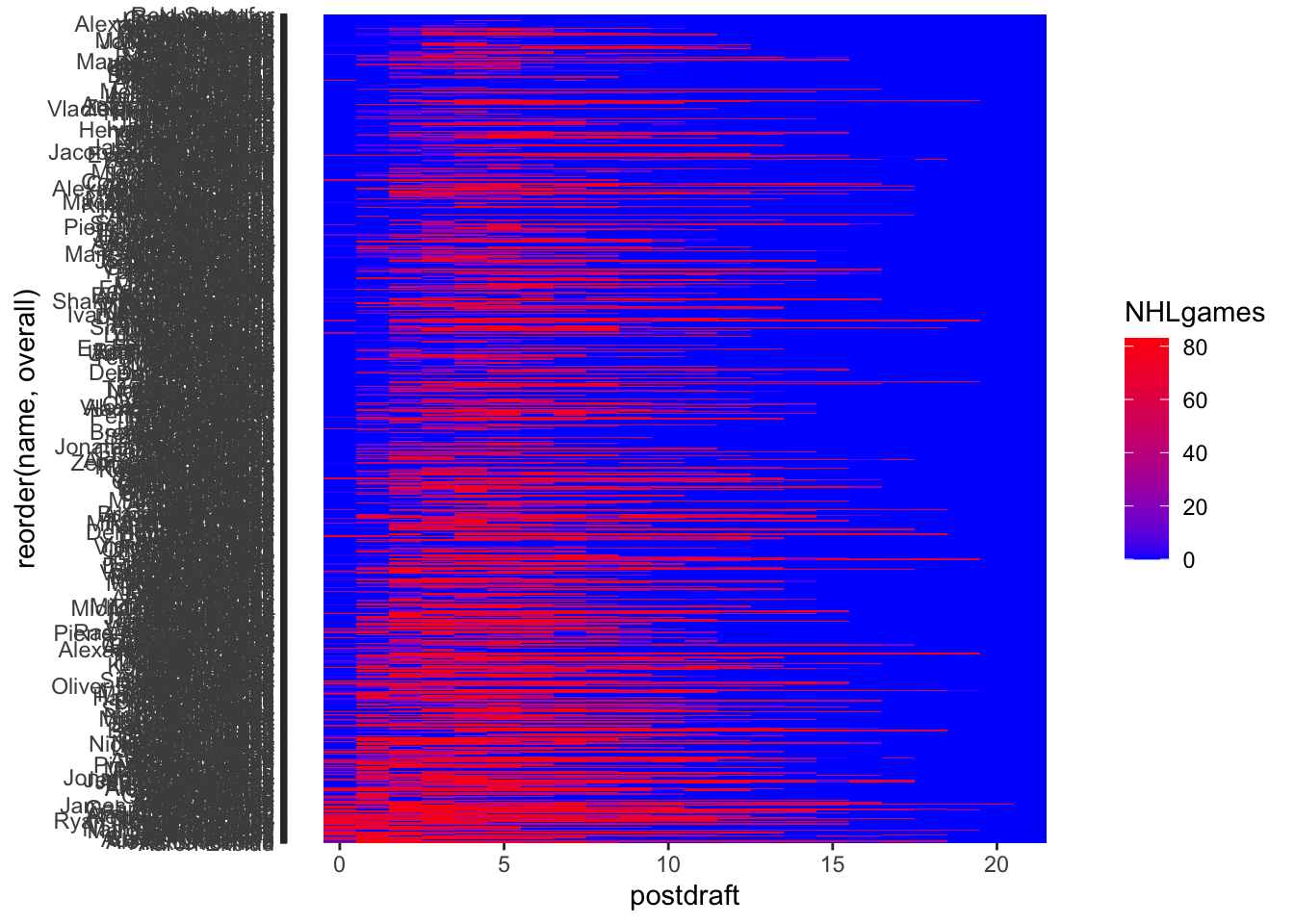
Could this be useful?

Code
round1<-NHLDraft%>%
  filter(round==1)

ggplot(round1, aes(y = reorder(name, overall), x = postdraft, fill = NHLgames)) +
  geom_tile() +
  scale_fill_gradient(low = "blue", high = "red")

OTHER STUFF TO CONSIDER

  1. Do these visualizations change as a function of player position?
  2. Is the number of NHL games played really the best metric to use?

CONCLUSION

Based on your visualizations, what would you advise regarding this trade proposal? Why?